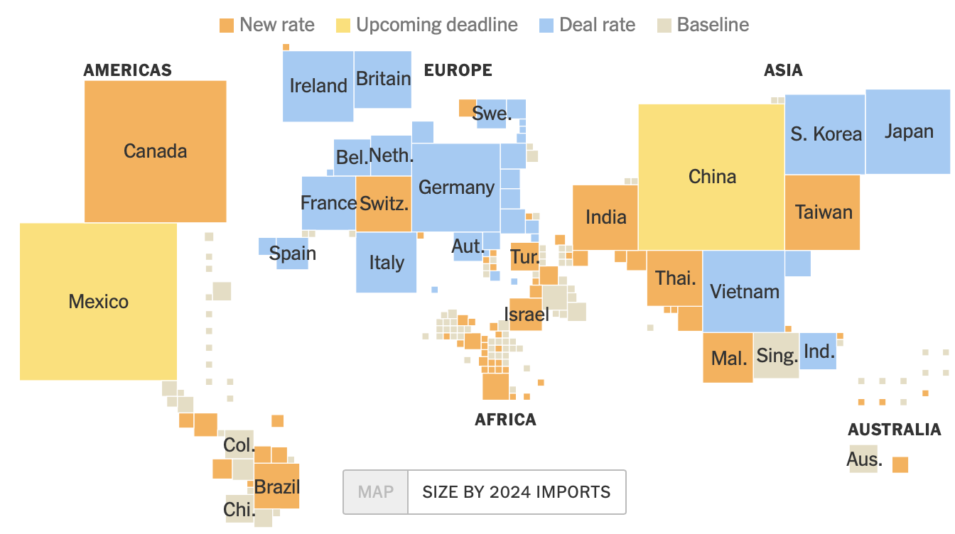
"The cartogram visualizes import sizes for 2024, where each country is scaled according to its total imports, providing a clearer representation of global trade dynamics."
"Countries are color-coded to signify their tariff status: new rate, upcoming deadline, deal rate, or baseline, allowing for immediate insight into their trade conditions."
"Despite the familiarity of standard geographic maps, the cartogram serves to deliver a more significant understanding of trade sizes by altering country dimensions based on import statistics."
"Tracking tariff statuses in cartogram form offers a fresh perspective on international economics, emphasizing the impact of import values rather than geographical territories."
The cartogram illustrates the 2024 tariff status for each country, scaled by the size of imports. Each nation is represented in proportion to its total imports, transforming standard geographic sizes for more meaningful comparisons. The color coding indicates various tariff statuses: new rates, upcoming deadlines, deal rates, and baselines. This visualization approach enhances understanding of global trade dynamics and highlights the significance of trade volumes over just geographic representations, providing important insights into international economics and tariff challenges.
Read at FlowingData
Unable to calculate read time
Collection
[
|
...
]