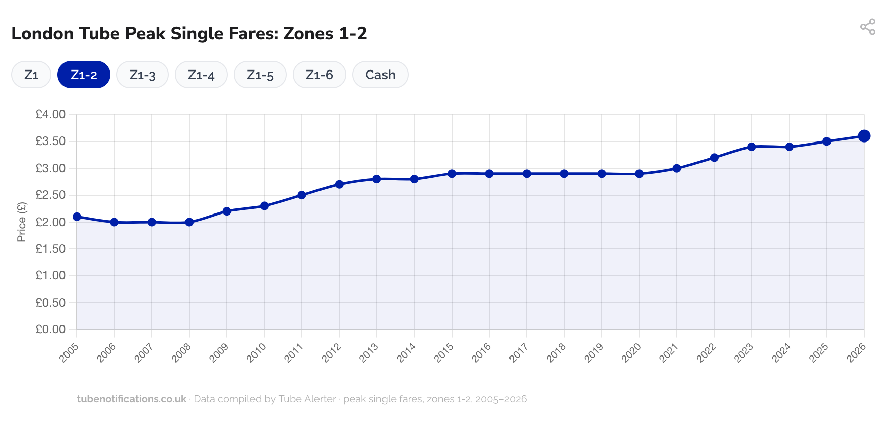
"In that time, a Zone 1 peak single fare has risen by 82 percent from £1.70 to £3.10. That might sound like a staggering increase, but when you adjust for inflation, those prices are roughly the same in real terms. The same goes for Zone 1 to Zone 2 and Zone 1 to Zone 3 fares."
"And while daily caps have risen - £5.20 for Zone 1 to Zone 2 in 2005 versus £8.90 in 2026 - they've actually decreased when you adjust for inflation. By today's money, the 2005 cap was £9.67."
"However, when you look at Zone 1 to Zone 6 peak single fares, there is more of a gap in real terms. These days that journey costs £5.60 but back in 2005 it was £2.10 which, adjusting for inflation, is equivalent to £3.83. That means that travelling in and out of London's outer zone is 54 percent more expensive in real terms today compared to 20 years ago."
Tube Alerter analyzed 21 years of London Underground fare data from 2005 to 2026, examining how prices changed when adjusted for inflation. Zone 1 peak single fares increased 82 percent nominally but remained roughly equivalent in real terms. Daily fare caps, despite rising from £5.20 to £8.90, are actually cheaper when inflation-adjusted. However, Zone 1 to Zone 6 journeys show a different pattern, costing 54 percent more in real terms today than in 2005. The data reveals that current fares are cheaper than during Boris Johnson's mayoral tenure, with the most expensive period occurring between 2013 and 2015.
Read at Time Out London
Unable to calculate read time
Collection
[
|
...
]