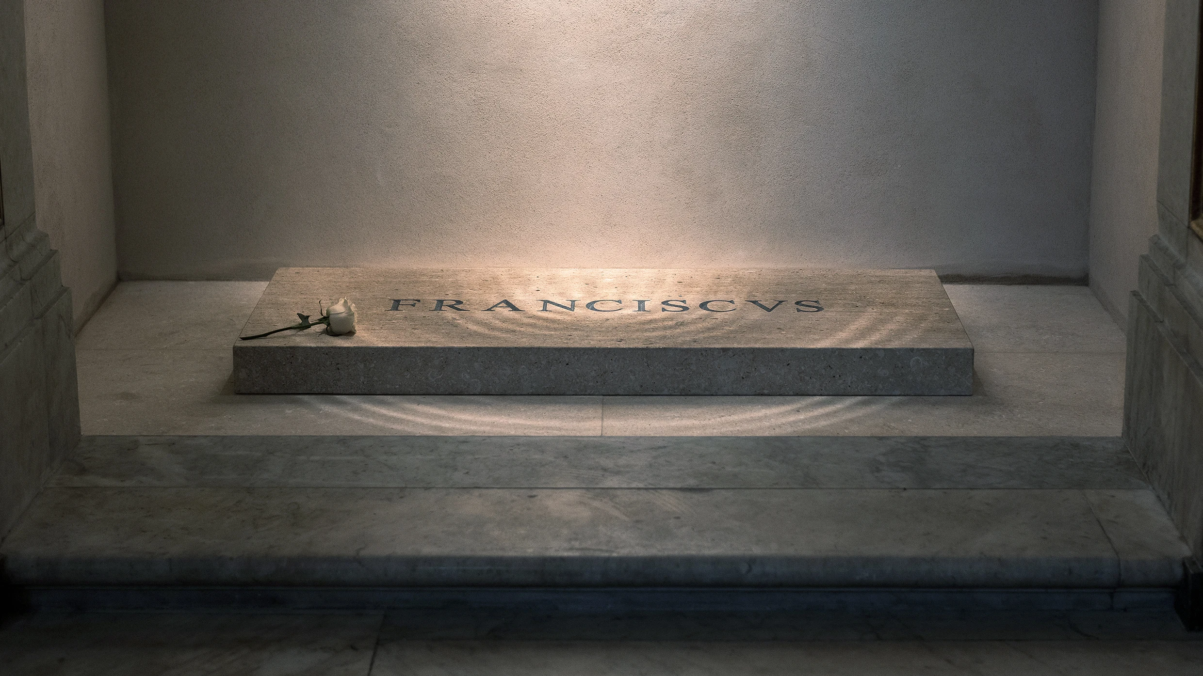
"Pope Francis's tomb, meant to symbolize humility, unfortunately features poorly spaced letters that detract from its design, leading to criticism online."
"Cheryl Jacobsen, a calligrapher, noted the engraving on Pope Francis's tomb is 'horrifically bad,' as there is 'no historical reason for spacing that bad.'"
"Christopher Calderhead commented that the poor kerning on Pope Francis's tomb lacks historical or aesthetic justification, highlighting a disconnect between intention and execution."
"Despite the beauty of Pope Francis's simple tomb design, the kerning issue has opened a broader discussion about the importance of craftsmanship even in sacred spaces."
Pope Francis was recently laid to rest in Rome, with his legacy marked by an empathetic modernizing approach to Catholicism. His simple tomb, crafted from Ligurian marble, reflects his modest nature. However, the inscription of his name, 'Franciscus,' has come under scrutiny for its poor kerning, sparking criticism on social media. While some view it as a humble gesture, experts like calligrapher Cheryl Jacobsen criticize the engraving as poorly executed, noting that it lacks the historical and aesthetic justification found in other papal tombs. This has ignited a discussion about quality craftsmanship in religious artifacts.
Read at Fast Company
Unable to calculate read time
Collection
[
|
...
]