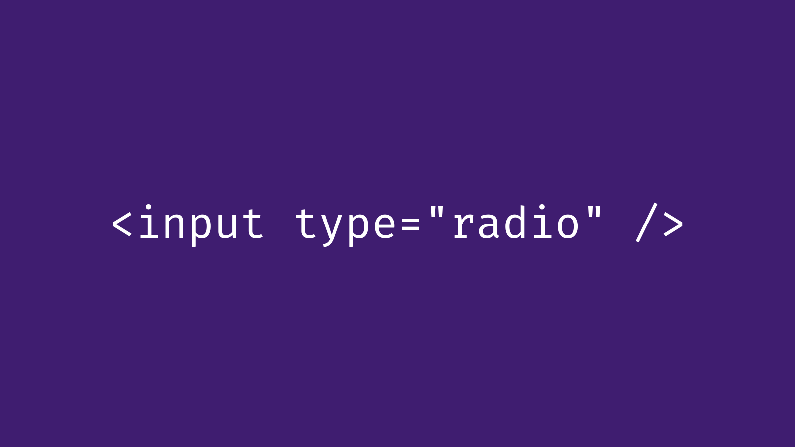
"I dug into our codebase and realized we were using two React components from Shadcn to power our radio buttons: <RadioGroup> and<RadioGroupItem>. For those unfamiliar with Shadcn, it's a UI framework that provides a bunch of prebuilt UI components for use in your websites. Unlike traditional UI frameworks like Bootstrap, you don't import it with a script tag or npm install. Instead you run a command that copies the components into your codebase."
"Woof... 3 imports and 45 lines of code. And it's importing a third party icon library just to render a circle. (Who needs CSS border-radius or the SVG<circle> element when you can add a third party dependency instead?) All of the styling is done by the 30 different Tailwind classes in the markup. I should probably just tweak those to fix the styling issues. But now I'm distracted, annoyed, and curious. Where's the actual <input>? What's the point of all this? Let's dig a little deeper."
"Radix Primitives is a low-level UI component library with a focus on accessibility, customization and developer experience. You can use these components either as the base layer of your design system, or adopt them incrementally."
A visual update for radio buttons revealed use of Shadcn React components <RadioGroup> and <RadioGroupItem>, which had been copied into the codebase. The exported code included multiple imports, an icon library, and about 45 lines of markup. Styling relied on roughly 30 Tailwind classes and a third-party icon just to render a circular indicator, obscuring the native <input> element. Shadcn builds styled components on top of Radix primitives. Radix supplies low-level, unstyled, accessibility-focused primitives while Shadcn applies styling, resulting in extra dependencies and added complexity for simple UI elements.
Read at Paulmakeswebsites
Unable to calculate read time
Collection
[
|
...
]