Deliverability
fromAWeber
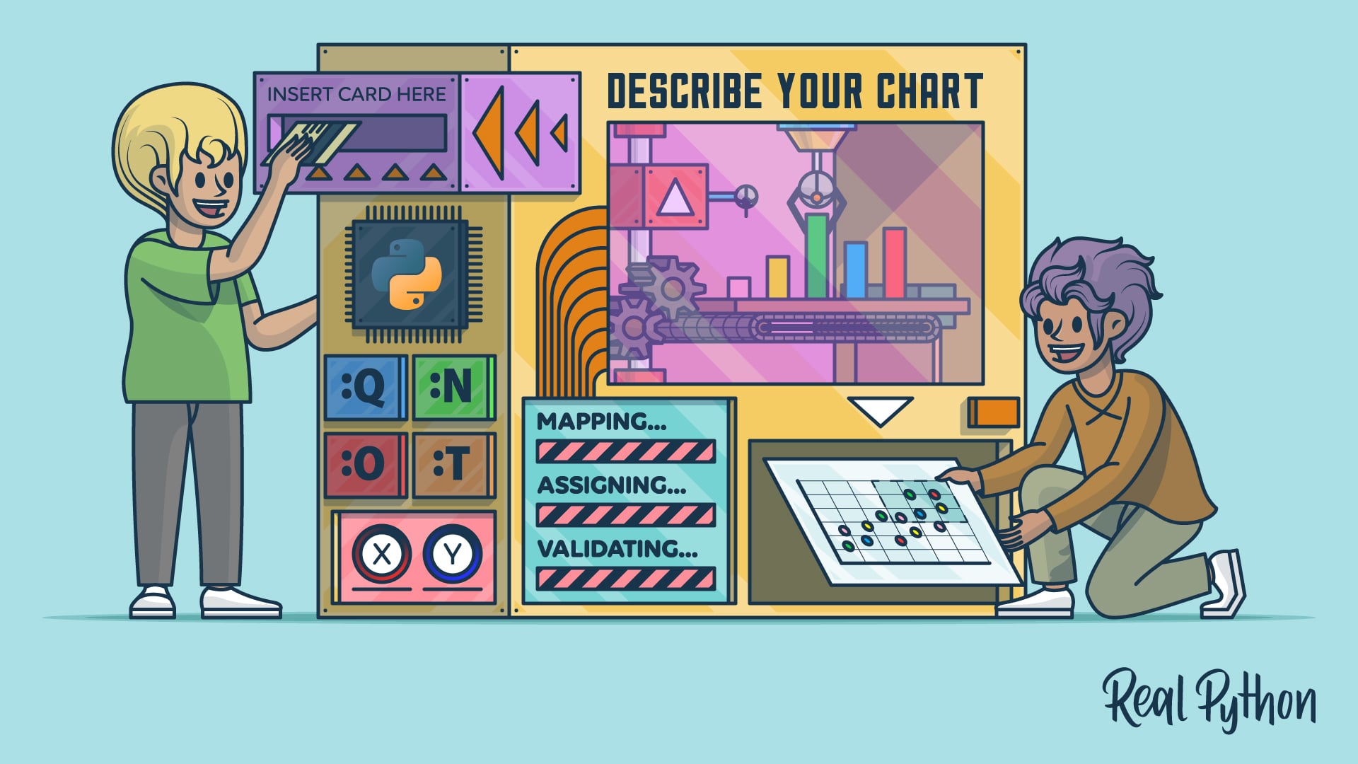
1 week agoDraft, Send, and Analyze. All From ChatGPT
AWeber integrates with ChatGPT, allowing users to manage email marketing through interactive visual tools and direct queries.
A comprehensive analysis of Google search patterns related to birds explores what species people seek information about most frequently. The investigation spans six interconnected analyses examining bird variety, taxonomic classifications, information sharing behaviors, birder sighting correlations with search trends, regional popularity differences across states, and temporal patterns in search interest.
Women face significant challenges finding properly fitting clothes due to two interconnected problems: natural variation in women's body shapes and sizes, and inconsistent sizing standards across different stores. The analysis demonstrates that no single size standard accommodates the diversity of women's bodies, while retailers further complicate matters by using different sizing systems.
Enter Snowiest.app, a free, donation-based weather aggregator website that is putting the raw data directly into the hands of skiers and riders. Snowiest isn't a forecaster-it's a model comparison tool. It helps you see agreement and uncertainty across multiple model outputs in one place . Designed for transparency, it puts the raw numbers front and center. Their data comes from globally recognized weather models such as:
Zach is the CMO and VP of digital marketing at CannaPlanners, where he leads a team powering SEO and digital growth for more than 150 dispensaries and 30 cannabis retailers nationwide. Zach honed his skills in the plumbing, HVAC and automotive industries, fields where success depends on mastering local search. We spent two minutes with Zach to learn more about his background, his creative inspirations and recent work he's admired.
Completely free and open source (view our licence here). data_object Supports export for integration with frameworks including React, Vue, and Angular. Fully configurable, featuring custom triggers and adjustable text to support multiple language locales. 60 languages supported by default (view the languages here). Includes multiple views, including Map, Line, Chart, Days, Months, and Color Ranges. export_notes Export data to multiple file formats (view the supported types here), with system clipboard setting support.
Pantone's Color of the Year Concept: The Pantone company produces the Pantone Matching System (PMS) and the Pantone Fashion, Home + Interiors (FHI) System, proprietary color spaces. PMS is used primarily in graphics for printing, packaging, and digital media. FHI is used in a wide range of other industries including fashion, cosmetics, fabric, plastics, and paints. When Pantone PMS inks are applied to a physical color reproduction process, it is frequently possible to accurately match the colors from your digital data visualization to hard copy output...
In his graphic design work, Aldon transforms periodic tables and dense masses of information into maximalist pieces of design, expressing information whilst also challenging the impossibility of taking it all in. Data sprawls across screens and pages, overlapping in overloads and feedback loops, communicating more the aesthetic of information rather than its substance, playing with images we have all seen in science classes or colour palettes. These are exploded infographics.
The chart showed the vote totals over time for Wisconsin. At first glance, it appeared that Joe Biden was lagging far behind Donald Trump and then suddenly surged ahead to a tie. Almost immediately, people online seized on the image, claiming that all those Biden votes were actually evidence of fraud. In fact, it was nothing of the sort, and both Trump and Biden's votes had increased - the result of a large batch of absentee and mail ballots being counted all at once.
What football fans expect from sports sites has shifted completely. Dry match reports about yesterday's game don't cut it anymore. People want real-time numbers, instant updates, and analytics they can actually dig into. Site owners who want to keep visitors around have no choice - static pages need to become living information hubs, and data visualization tools make that happen. High-quality infographics are becoming just as important an element as original articles.
Another year. It passed extremely fast and yet, painfully slow. Despite developing tech that some think might take over our day-to-day work, data things got made by people this year. These are my favorites. Inside the Confusing World of Women's Clothing Sizes They approached the topic from several angles with 3-D models, data collection, and sizing charts. Adding to the visualization genre of variable clothes sizes, this piece helped me appreciate the process that is women's shopping. [ See the Project / On FlowingData]
Even if you were unfamiliar with the concept, each day - perhaps several times a day - you might have peered anxiously through the lens of your macroscope of choice, and what you saw determined whether your day would be one marked by anxiety or relief, hope or despair.
When we consider the subway, it's often for reasons that have to do with decay and deterioration. The switches are outdated. The elevators are broken. The train is late (again). Of course it could be better, but rarely do we pause to take in what the system does right. Its 25 lines, 472 stations, and 665 miles of track traverse the city and offer a tremendous amount of mobility.
A Post analysis of internal data from the first half of the year shows that supplies valued at more than $190 million were scheduled to arrive at distribution warehouses by the end of June. Instead, the analysis found, shipments worth nearly $76 million were not delivered, including the majority of medication needed to combat severe malaria. Some medicines never left the places where they were manufactured, and others were stranded in ports or customs facilities near the cities and villages where they were needed.
When an incident occurs, every second counts. Whether it's a security breach, theft, or an unauthorized access attempt, physical security teams must act quickly to determine what happened, who was involved, and what actions to take next. Digging through hours of footage, manually piecing together evidence, and cross-referencing logs can be slow and cumbersome. But with a modern video management system ( VMS), security teams can streamline investigations, improve response times, and uncover critical insights faster - "supercharging" their investigations.
Can you create a histogram of game total scores to see the distribution of scoring? Could you make a box plot comparing home vs away team scores? Let's create a scatter plot of temperature vs total score to see if weather affects scoring. Can you show me the distribution of betting spreads and how they relate to actual game results? Could you create a visualization showing win/loss records by team?