#data-visualization
#data-visualization
[ follow ]
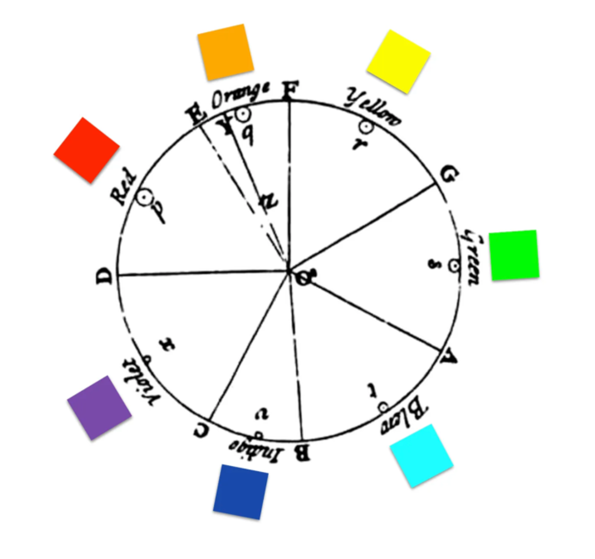
#user-experience #generative-ai #business-intelligence #collaboration #dashboard-design #color-deficiency


fromFast Company
2 weeks agoThis charming animation is a love letter to New York City's subway
When we consider the subway, it's often for reasons that have to do with decay and deterioration. The switches are outdated. The elevators are broken. The train is late (again). Of course it could be better, but rarely do we pause to take in what the system does right. Its 25 lines, 472 stations, and 665 miles of track traverse the city and offer a tremendous amount of mobility.
Graphic design
fromFlowingData
3 weeks agoUndelivered USAID medical supplies and medicine
A Post analysis of internal data from the first half of the year shows that supplies valued at more than $190 million were scheduled to arrive at distribution warehouses by the end of June. Instead, the analysis found, shipments worth nearly $76 million were not delivered, including the majority of medication needed to combat severe malaria. Some medicines never left the places where they were manufactured, and others were stranded in ports or customs facilities near the cities and villages where they were needed.
US politics
fromSecuritymagazine
1 month agoFirst Line of Defense: The Role of Modern VMS in Supercharging Investigations
When an incident occurs, every second counts. Whether it's a security breach, theft, or an unauthorized access attempt, physical security teams must act quickly to determine what happened, who was involved, and what actions to take next. Digging through hours of footage, manually piecing together evidence, and cross-referencing logs can be slow and cumbersome. But with a modern video management system ( VMS), security teams can streamline investigations, improve response times, and uncover critical insights faster - "supercharging" their investigations.
Information security
Privacy professionals
fromWIRED
1 month agoFor One Glorious Morning, a Website Saved San Francisco From Parking Tickets
A public tool mapped sequential parking-ticket IDs to reveal parking officers' routes, ticket patterns, and fines, enabling tracking and leaderboards of officers' enforcement activity.
Artificial intelligence
fromInfoQ
1 month agoMultidimensionality: Using Spatial Intelligence x Spatial Computing to Create New Worlds
XR development now integrates AI-driven data visualization through ETL pipelines, hand-tracking interactions, and modern pass-through mixed-reality hardware enabling in-editor development.
fromInfoWorld
1 month agoDatabot: AI-assisted data analysis in R or Python
Can you create a histogram of game total scores to see the distribution of scoring? Could you make a box plot comparing home vs away team scores? Let's create a scatter plot of temperature vs total score to see if weather affects scoring. Can you show me the distribution of betting spreads and how they relate to actual game results? Could you create a visualization showing win/loss records by team?
Data science


Web development
fromMedium
4 months agobillboard.js 3.16.0 release: bar trending line & improved resizing performance!
New bar trending line connects bars, helping visualize range gaps with customizable styles.
Improved axis.tick.culling now supports reversed tick text display for better readability.
The axis.evalTextSize feature allows precise adjustments of tick text sizes for styling needs.
Significant performance enhancements improve runtime efficiency during resizing operations.


fromYanko Design - Modern Industrial Design News
4 months agoEconomic and environmental data become tangible objects in creative art installation - Yanko Design
Fragapane transforms cold data into engaging, emotional forms, using beauty to connect viewers with living narratives behind stark statistics.
Data science
Graphic design
fromdesignboom | architecture & design magazine
4 months ago'data is not neutral': federica fragapane's soft forms visualize hard facts on inequalities
Federica Fragapane transforms hard realities of inequalities into compelling visual narratives, combining both scientific rigor and artistic sensitivity.
Design
fromBarchart.com
4 months agoFrom Search to Suggestion: How AI is Reshaping the Digital Ad Economy
Utilizing chart templates can streamline your data visualization process.
Switching the Market flag allows for localized data access.
The Interactive Chart menu expands customization options.
Up/down arrows facilitate quick symbol navigation.


Marketing tech
fromTechCrunch
5 months agoExclusive: Fieldstone Bio is building microbes that can sense everything from TNT to arsenic | TechCrunch
Fieldstone Bio aims to transform microbial activity into actionable sensors for environmental insights and safety, enhancing data visibility with advanced biotechnology.
fromClickUp
5 months agoHow to Make a Waterfall Chart in Google Sheets for Data Analysis
A waterfall chart in Google Sheets is an effective visualization tool, clarifying how positive and negative values contribute to overall results, starting each bar where the previous one ends.
Business intelligence
Business intelligence
fromClickUp
6 months agoTop 10 Business Intelligence (BI) Software in 2025 | ClickUp
Business intelligence tools simplify data management and enhance decision-making processes for companies.
Using business intelligence software can lead to a substantial increase in decision-making speed.
Data science
fromUX Magazine
6 months agoThe Ultimate Data Visualization Handbook for Designers
Data visualization is crucial for making sense of the vast amounts of data generated daily.
Clarity and simplicity are essential in effective data visualization design.
Choosing the right methods and tools is fundamental in the visualization process.
[ Load more ]