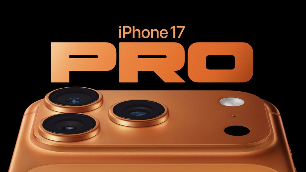
"We have several doubts about the new iPhone lineup. What's the point of the iPhone Air? Do we really want a cross-body iPhone strap? And why isn't there a black iPhone Pro? But if there's one thing that Apple got right, it's the perfect shape of the 'O' in the iPhone 17 Pro typography. The "O" in iPhone 17 Pro perfectly matches the phone's plateau pic.twitter.com/BFRwm9BspR September 14, 2025"
"Apple's know for its attention to design details (we'll forget about the Magic Mouse for now). But sometimes it focuses on details so subtle that barely anybody notices them. As pointed out by one keen-eyed Apple fan in the post on X above, the typography used for the iPhone 17 Pro logo appears to have been chosen based on the product design."
Apple is known for meticulous design details, with occasional choices so subtle they go unnoticed by most users. A playful aside rejects the Magic Mouse as an exception to Apple’s design success. Several questions arise about the new iPhone lineup, including the purpose of the iPhone Air, the desirability of a cross-body iPhone strap, and the absence of a black iPhone Pro. The 'O' in the iPhone 17 Pro typography matches the phone's raised camera plateau. A fan on X noted that the typography appears selected to echo the product's physical design.
Read at Creative Bloq
Unable to calculate read time
Collection
[
|
...
]