fromYanko Design - Modern Industrial Design News
1 month agoSkip the Chocolate: 5 Design-Centric Gifts That'll Actually Get Used - Yanko Design
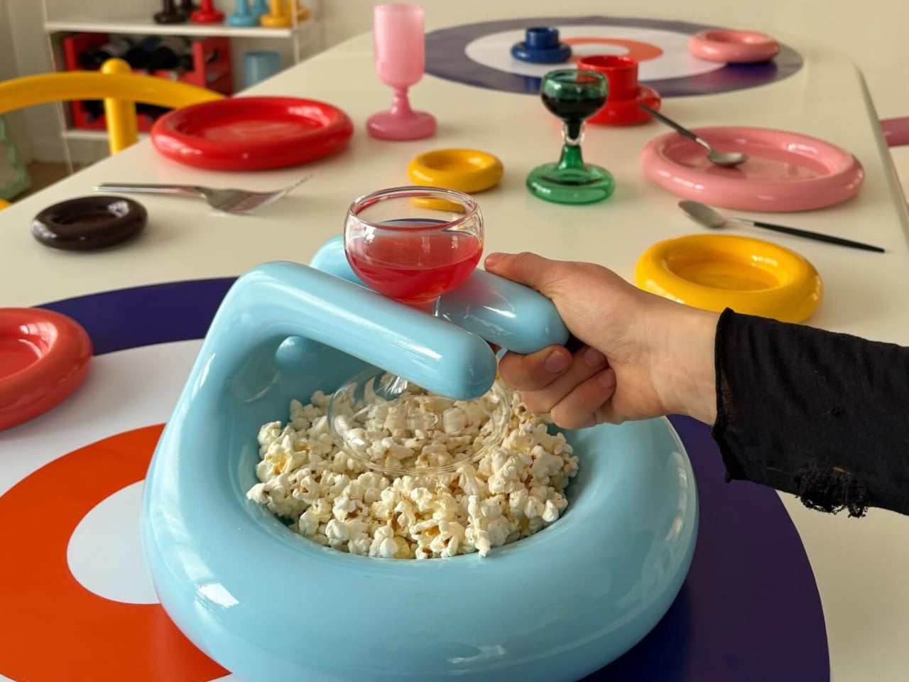
Chocolate disappears in minutes, leaving nothing but an empty wrapper and fleeting satisfaction. The best gifts aren't consumed and forgotten; they become daily companions that elevate ordinary moments into something special. Design-centric objects strike that perfect balance between aesthetic beauty and genuine utility, transforming mundane tasks into opportunities for delight. These aren't decorative dust collectors destined for a forgotten shelf. They're thoughtfully crafted tools that earn their place in everyday life through both visual appeal and practical performance.