"The most important design element, though, "was the picture that had come back from Apollo 8 about a year before, the first vision of the Earth as seen from space, and this fragile, blue-white marble in the black void, arguably the most important photograph ever taken," McKibben tells Fast Company."
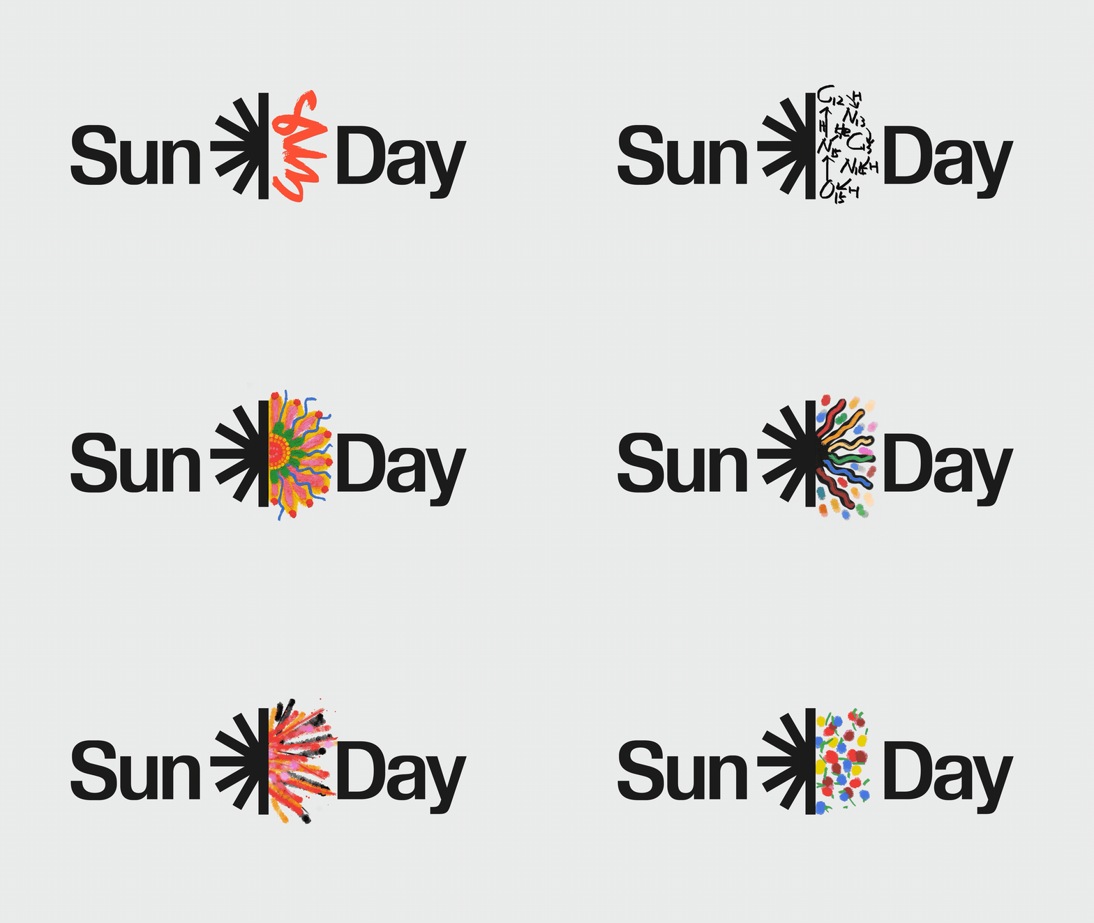
"The resulting logo represents only half the sun, with an asterisk-style mark on the left side and a blank space on the right for people to fill in their own drawing. As a symbol, the sun is simple and easily abstracted; as a work of advocacy, it gives people a first thing to do. It's participatory by design."
"The basic message becomes we have half of what we need, we now have the technology. We live on a planet where the cheapest way to make power is to point a sheet of glass at the sun," McKibben says, noting that what's lacking is the political will to make clean energy work."
Bill McKibben and Denis Hayes founded Sun Day as a global day of action on Sunday, September 21. The initiative shifted from an initial 'Sky Day' idea after designers realized the sun is the universal, easily drawn symbol. The Sun Day logo intentionally depicts only half the sun with an asterisk-style mark and blank space to invite public completion and participation. The design symbolizes that technology for solar power now exists and is inexpensive in many places, while the primary barrier to widescale clean energy deployment remains political will. Collins created the branding.
Read at Fast Company
Unable to calculate read time
Collection
[
|
...
]