"It felt more welcoming... We wanted it to feel like an expression that was really inviting for all types of creative."
"It's taken a little while to get back to what we're great and known for...the idea of being drawn to create."
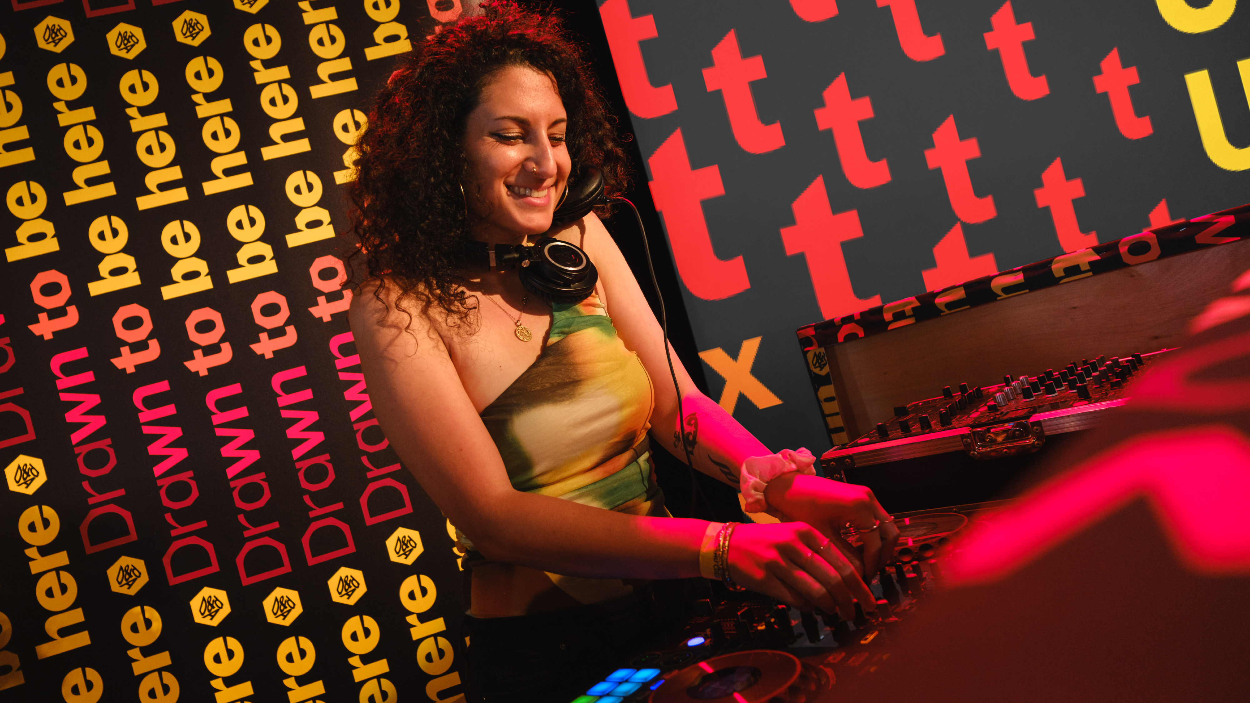
"It was essentially two campaigns, a festival experience and an awards ceremony experience."
"The identity centres around the iconic Pencil and a bold new typeface created with Studio DRAMA, Pencil Gothic."
JKR has taken the challenge of rebranding the D&AD Awards, centering their new identity around visibility and creativity. The design features the iconic Pencil and a new typeface, Pencil Gothic, which adapts across various festival elements including signage and stage designs. Lisa Smith, JKR's global executive creative director, noted the shift back to D&AD's roots of inviting all creative types to engage. The move follows a more conservative approach post-pandemic, aiming to make the festival welcoming and impactful for participants.
Read at Creative Bloq
Unable to calculate read time
Collection
[
|
...
]