"Scotland-based law firm Shepherd and Wedderburn has recently been hit with accusations of logo plagiarism, with claims its design is strikingly similar to Serena Williams' jewellery brand. While the Tennis star has yet to comment on the controversy, the law firm has defended the design, citing the contrast of the brands in question. While logo design disputes are nothing new, rarely are they sparked by public attention. While the controversy appears entirely coincidental, it has raised questions about how the allegedly identical logo design wasn't flagged. However, with no legal action currently served, it seems the law firm is standing strong with its rebranded identity."
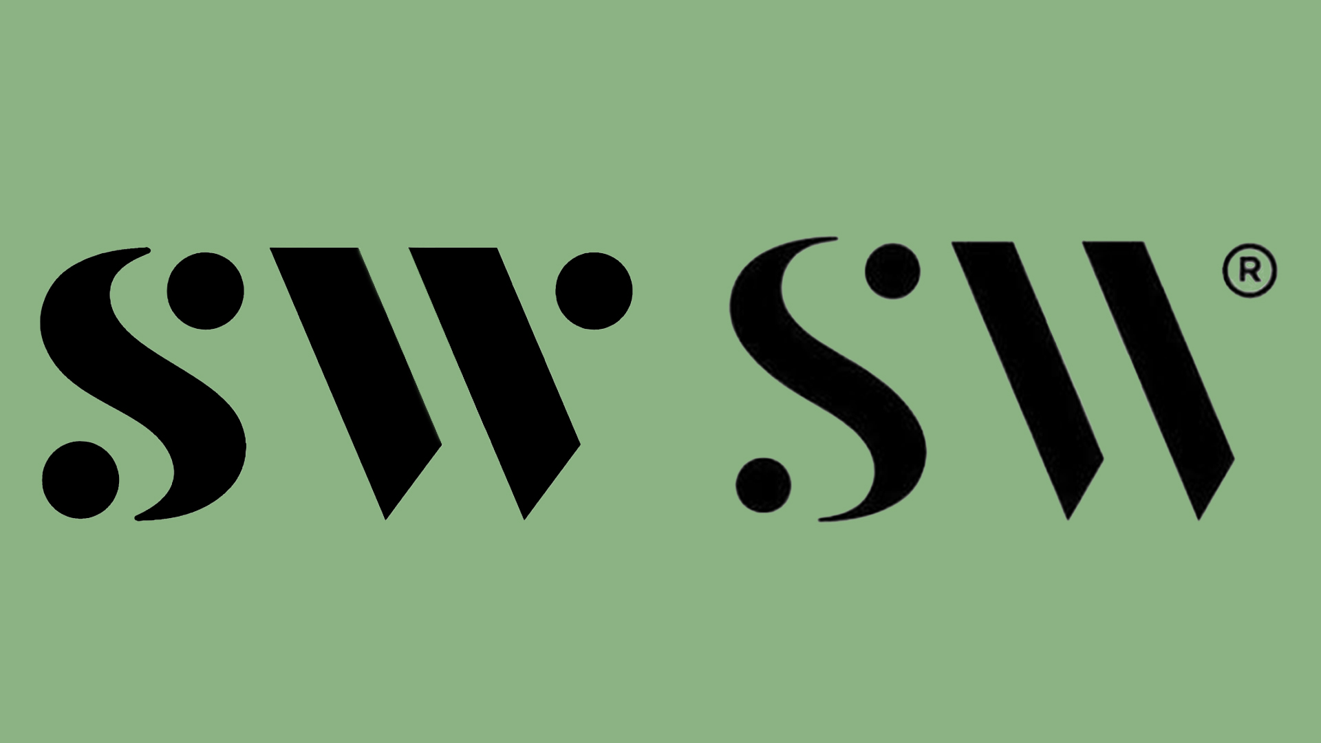
"The design in question features a stylised 'SW' motif, with circular accents on the 'S' and single slanted lines representing the 'W'. While there are slight discrepancies between the law firm and Williams' logos, the typographical styles and composition made it nearly impossible for critics not to draw comparisons. Created by Neon Brand Consultancy, the rebrand was supposed to mark an "exciting new chapter" for the law firm. In response to criticism, a spokesperson for Shepherd and Wedderburn told The Times, "Any similarities with other brands are purely coincidental. It is highly unlikely there will be any consumer confusion between a law firm and Serena Williams' jewellery range.""
"(Image credit: Shepherd and Wedderburn) While Williams and her team haven't responded to the controversy yet, at least the law firm is well-equipped to handle any potential legal issues that may crop up. For more design disputes, check out how this "essentially identical" logo reignited a 40-year brand war or take a look at Ferrari's logo battle against an unexpectedly bizarre opponent."
Shepherd and Wedderburn has been accused of logo plagiarism after the firm's new 'SW' mark drew comparisons to Serena Williams' jewellery brand. The contested design features a stylised 'SW' motif with circular accents on the 'S' and slanted lines for the 'W', prompting critics to note strong typographical and compositional similarities. The rebrand was created by Neon Brand Consultancy and intended to mark an "exciting new chapter". A firm spokesperson said any similarities are purely coincidental and that consumer confusion between a law firm and a jewellery range is unlikely. No legal action has been served and Williams has not commented.
Read at Creative Bloq
Unable to calculate read time
Collection
[
|
...
]