"Financial brands have developed a reputation for being corporate and oftentimes, a little dull, but that doesn't have to be the case. Switching up the stereotype is Tilt, a fintech company focused on empowering people without dwelling on their financial past. The best rebrands strengthen a brand by digging into its heritage and values, creating a new identity that's succinct and strong."
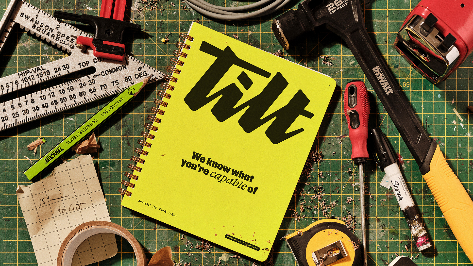
"With gritty visuals, a lively colour palette and a distinctly human brand voice, Tilt is no different, proving that bold design and passionate copy can birth a brand steeped in authenticity. Created by branding agency Ragged Edge, Tilt's rebrand was crafted "for the working rather than the wealthy," with a distinctly human appeal throughout. Central to the rebrand is a new logo featuring signature style typography for a bespoke appeal."
"Tilt's brand voice is one of passion and action, with a candidness and urgency for change. "So many brands try to act like your friend. But Tilt customers don't need another friend," says Fia Townshend, copy director at Ragged Edge. "They need help kicking down doors. So the Tilt voice has an urgent and unwavering belief that emboldens people to keep pushing.""
Tilt reframes fintech by prioritising empowerment over past financial histories and rejecting corporate dullness. The visual identity pairs gritty, imperfect illustrations and a lively colour palette with a bespoke logo and signature typography to convey authenticity and optimism. A physical tilt in the customised headline script creates movement and progression while an injection of chartreuse adds personality. The brand voice emphasizes passion, urgency and actionable support, positioning the company as an emboldening force for people who have felt let down by the system. The rebrand targets working people with a human-first, straightforward approach to finance.
Read at Creative Bloq
Unable to calculate read time
Collection
[
|
...
]