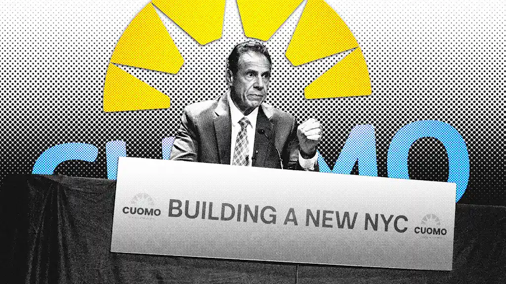
"Cuomo's new logo is meant to symbolize a new phase of the campaign, designed to evoke a rising sun and resemble the Statue of Liberty's crown."
"The blue-and-orange color palette of the new logo aligns with the New York City flag, indicating a strong local identity."
"Cuomo's previous campaign logo was criticized as generic and under-branded, suggesting a lack of visual identity to compete effectively."
"Cuomo's new branding aims to improve upon previous efforts, acknowledging the importance of visual rhetoric in political campaigns."
Andrew Cuomo recently launched a new campaign logo aimed at marking a new phase in his mayoral race. The logo, designed to evoke a rising sun and the Statue of Liberty's crown, features a blue-and-orange color palette similar to the New York City flag. It represents a strategic shift from his previous generic logo used during the Democratic primaries. The new design indicates Cuomo's campaign recognizes the importance of visual identity in politics, especially in contrast to competitors with more memorable branding.
Read at Fast Company
Unable to calculate read time
Collection
[
|
...
]