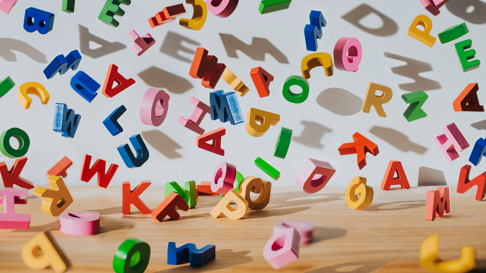
#typography
#typography
[ follow ]
#branding #graphic-design #design #accessibility #css #web-design #brand-identity #type-design #fonts #layout
fromJezebel
3 days agoHelvetica is Too Woke for Marco Rubio, Apparently
In a cable dated December 9 and obtained by Reuters, Rubio reportedly wrote: "To restore decorum and professionalism to the Department's written work products and abolish yet another wasteful DEIA program, the Department is returning to Times New Roman as its standard typeface." (The subject line of the directive is, "Return to Tradition: Times New Roman 14-Point Font Required for All Department Paper.")
US politics
fromIntelligencer
3 days agoNow the Trump Administration Is Coming After Our Fonts
If I had to pick a word to describe Calibri, the sans serif typeface which was the default font for Microsoft apps from 2007 to 2024, it would probably be "inoffensive." Sure, Microsoft's "extremely readable" font has had its critics over the years, but they've mostly just complained that it's too plain, that it lacks personality. I'd bet that for most people, Calibri just became a ubiquitous, thoughtless part of their normal life, from office memos to book reports,
US politics


fromAlways Twisted
3 weeks agoGenerating Utility Classes from Design Tokens using Style Dictionary
This article shows a practical pattern for generating utility classes in CSS I've used in one form or another since 2016. Utility classes can give us a fast, consistent way to apply design system values in markup, without sprinkling hard‑coded styles across your project. As I discussed in my article on Creating Design System Friendly Snowflakes with Utility Classes, utility classes can really help offer a middle ground between rigid components and completely custom CSS.
Design
fromFast Company
5 days ago'American Canto' was designed to be a modern classic
Judge a book by its cover, and you might think that American Canto, the memoir by Vanity Fair's outgoing West Coast editor Olivia Nuzzi, is destined to be a classic. The memoir, which chronicles Nuzzi's drama-filled life and career as a political reporter in the Trump era, features a strikingly simple cover that serves as shorthand for the book's ambitions. "The intent was to give the book a clean, no-frills design that felt both classic and contemporary,"
Books
US politics
fromJezebel
1 week agoType Artist Who Created the Font the White House Now Uses Says 'Fuck Trump'
The White House redesigned its website on January 20 using Instrument Serif and Instrument Sans, fonts co-created by Jordan Egstad and Rodrigo Fuenzalida, prompting personal and political reactions.


fromItsnicethat
2 weeks agoTypeone's tenth issue shows us the important type design of the 21st century so far
Nodding back to the first issue of Typeone, the design system features Diatype from Dinamo, with Xiaoyuan Gao's Common Sans which, for a moment, was nearly the solo typeface of the whole magazine for its "exuberance and sincerity", says Harry.
Typography
fromwww.creativebloq.com
3 weeks agoIs it just me, or is this font suddenly everywhere?
During the flat design boom of the 2010s, blocky sans-serif fonts were everywhere. Crisp, clean text adorned websites and shopfronts, with more decorative serif fonts seen as fussy and passe. But the tide appears to have turned on the serif vs sans serif debate. From protein bars to sneaker ads to AI brands, it seems everybody is embracing retro typographical aesthetics.
Typography
Typography
fromItsnicethat
3 weeks agoCurves plot planetary orbits and ligatures trace shooting stars in Gwennina Moigne's astrological typeface
Solæ typeface evolved gradually over years, culminating in a collaborative poster series and a Paris launch that showcased its versatility and designers' creativity.
fromAuldenglish
4 weeks agoAuld English fonts: A Sea-Change in the Look of Language by Nick Shinn
Today's English alphabet is unchanged since the 16th century-with one exception: the long‑s fell from use circa 1800. Previously, there had been two forms of the letter /s: a long (tall) version at the beginning and in the middle of words, and another, our present‑day /s, at the end of words. The reform used the terminal version throughout. There are two theories as to why this occurred, neither satisfactory.


fromMission Local
1 month agoWhat's on now at San Francisco museums, November 2025
There's a lot going on here. Through this weekend, there is a Behind-the-Screams Tour, where guests will face skeletons, parasites, bloodsuckers, and more from the collection. The newly renovated Wilson Family Nature Lab is opened in mid-October with lots of hands-on learning. Coming up on Nov. 22, there is a one-night only Welcome Winter Night, with two baby reindeer (and a naming contest), magic shows, and lots of other activities.
Typography
fromwww.sitepoint.com
1 month agoKindly Give Your Precious Feedback on my new website design
Hey everyone, I have been working on a new website and would love some honest feedback from the community. I have focused on usability, visual balance, and performance, but I'm sure there's room for improvement. You can check it out here:Instagram Story Viewer I would really appreciate your thoughts on the layout, typography, and overall experience anything that stands out as good or bad. Thanks in advance for taking the time!
UX design
fromItsnicethat
2 months agoMagazine C is an ergonomic study of iconic chairs as cultural touchstones
Editorially, the magazine has a modern visual style that is as elegant as the chairs it features. Each issue promotes simplicity and ease in its reading style, opting for uncluttered information - a type of ergonomic reading experience that matches well to the serenity of sitting in a comfortable chair or the act of appreciating the artistic value of furniture. It's academic content with an accessible, contemporary visual voice.
Design


fromItsnicethat
2 months agoThis collaborative typeface made from coloured tape is called... (you guessed it) Tapeface
"It's an amazing idea, and it's surprising that it hasn't knowingly been done before. "Tape felt like the perfect tool to disrupt typographic tradition. It's fast, tactile, and unruly," says Varanda. "What fascinated me most was how tape could act as both a restriction and a liberation. It forces letterforms into sharp edges, but in the hands of 27 participants, it created shapes that I could never have imagined alone."
Typography
fromPangram Pangram Foundry
2 months agoHow to create a typographic hierarchy
No matter what you're designing for - maybe it's a website? A brand? A magazine, perhaps? - typographic hierarchy is your foundation, your building blocks. It's what guides your reader through your website, brand or book. It tells them what to look at first, what to skim, and what to remember. Done right, it's seamless. Done wrong, it can be extremely confusing.In short, hierarchy is how you visually structure information. Here's how to do it well.
Typography
fromInside Higher Ed | Higher Education News, Events and Jobs
2 months agoThe Em Dash Debate We Should Be Having (opinion)
It seems a day does not go by without seeing someone confidently assert on social media that an em dash is not an indicator of AI-written text. Those social media posts are in response to an ongoing debate about whether or not the em dash is a dead giveaway of writing produced by generative AI. Some writers and academics resent that their cherished em dash is getting a bad rap. As one writes, "You can take my em dash from my cold, dead hands."
Typography


Typography
fromOpen Culture
2 months agoExplore a New Digital Edition of Printing Types, the Authoritative History of Printing & Typography from 1922
Times New Roman has been in use since 1931 and became a default font; American printers like the Merrymount Press adopted it alongside influential typographic works.

fromdesignboom | architecture & design magazine
2 months agoorganic motion graphics and futuristic typography compose dany vo's aveda congress runway
At the recent AVEDA Congress show, designer and creative director Dany Vo introduced a stage environment shaped by motion graphics, typography, and visual storytelling. Acting as creative lead, Vo developed a motion-driven backdrop that interacted directly with the choreography, transforming the runway into a spatial narrative rather than a static presentation. The visuals, composed of shifting typography and organic graphic forms, were synchronized with the movement of models and garments.
Fashion & style


fromCreative Bloq
3 months agoBlank Street unveils Instagram-worthy new brand identity
While I'm not typically a fan of minimalist design, some brands call for stripped-back branding, and one company that's nailing the aesthetic is Blank Street. A Gen Z favourite, the laidback highstreet coffee store knows its customers to a tee, championing chic, lowkey vibes with a deliciously Instagrammable aesthetic. Recently unveiling its slick new rebrand, Blank Street reestablishes itself as a global lifestyle brand, owning its identity as a cult favourite.
Design
Arts
fromJuxtapoz
3 months agoJuxtapoz Magazine - A Lifetime of Work is Captured in Scott Albrecht's "What Holds Us"
Scott Albrecht's What Holds Us explores how a traumatic brain injury prompted introspection about human connection, transforming typography into meditative three-dimensional works that encourage empathy.
fromCreative Bloq
3 months agoWow, there's a Guinness World Record for identifying fonts. Could you beat it?
This week it's the 70th birthday of the Guinness Book of Records, that gloriously bonkers compendium of human achievement that celebrates the people who can stuff the most marshmallows in their mouth, balance the most spoons on their body, and hula hoop underwater for the longest time. It features everything from standard athletic victories to "most high fives in 30 seconds" and "fastest time to make a pasta necklace."
Typography
fromwww.theguardian.com
4 months agoCan you solve it? Ambigrams you won't believe these flipping words!
Douglas Hofstadter is possibly best known for coining the term ambigram in 1983. An ambigram can be read in more than one way, commonly exhibiting left-right mirror symmetry or 180-degree rotational symmetry.
Typography
[ Load more ]