"The process for any creative starts with throwing ourselves into the world of the IP. John Wick was an easy one with us being fans of the films."
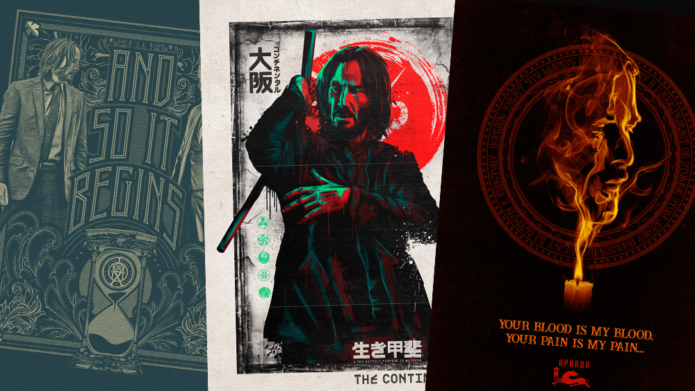
"From a hidden bullet in negative space to reflections in shattered glass, their posters are rich in detail and metaphor."
"A simple silhouette of a nunchuck, or even John Wick himself instantly tells you what you are looking at."
"Stylised, violent and drawing on iconography from art deco and classic poster design, theyâve become an essential part of the franchiseâs identity."
For over a decade, Fluid has crafted striking John Wick movie posters, creating a visual identity that is both stylish and rooted in the films' rich lore. The creative team, vastly familiar with the narrative, embeds hidden symbols and storytelling elements into the designs, engaging both dedicated fans and casual viewers. Details such as reflections and subtle metaphors enrich the artwork, making each poster a compelling invitation to the world of John Wick, while maintaining immediate recognition through iconic imagery.
Read at Creative Bloq
Unable to calculate read time
Collection
[
|
...
]