"We needed a visual identity that was uniquely Getty and distinct enough to unify how we show up globally. This system gives Getty one clear, ownable expression in support of the work we do around the world."
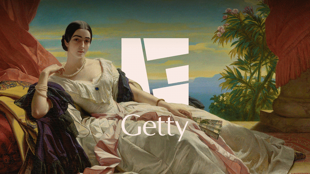
"The new logo constructs the letter G from four shapes arranged into a square to symbolize the Getty's four programs. The mark was inspired by the materiality of the travertine blocks at the Getty Center, with the team wanting a mark that felt like it was built with weight and intention."
"The G also acts as a frame for the Getty's collection. In early applications of the mark, artwork and sculptures peek in and over its shapes, adding a contemporary element to visuals that might otherwise read as old and dry to some audiences."
The J. Paul Getty Trust, founded in 1953, operates multiple entities including the Getty Center and Getty Villa museums, a foundation, conservation institute, and research institute. The organization replaced its iconic 1997 logo designed by Saul Bass with a new flexible identity created by Fred & Farid New York. The new logo features a letter G constructed from four shapes arranged in a square, symbolizing the Getty's four programs. The design was inspired by travertine blocks at the Getty Center and maintains visual connection to Bass's original square format. The G functions as a frame for artwork and sculptures, allowing collection pieces to integrate into the mark. The updated color palette features Getty's signature blue with accent hues derived from the institution's architecture, artworks, and gardens.
Read at Fast Company
Unable to calculate read time
Collection
[
|
...
]