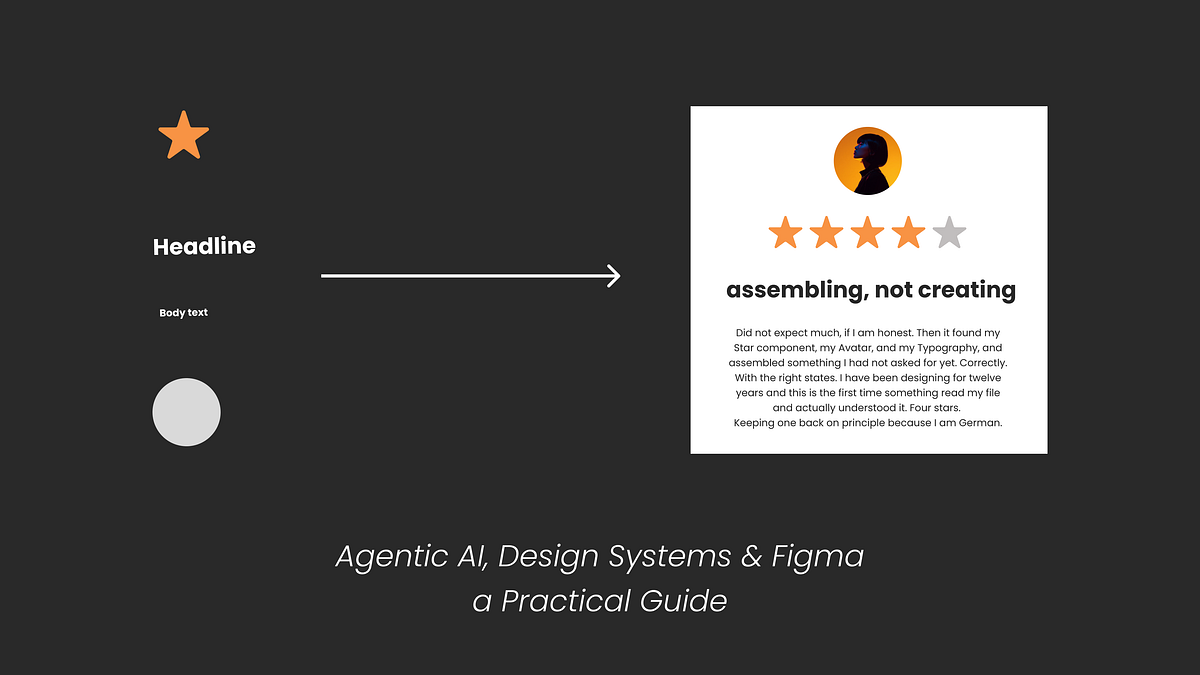
#design-systems
#design-systems
[ follow ]
#figma #design-tokens #user-experience #accessibility #ai-in-design #productivity #product-design #css #theming


UX design
fromInfoWorld
1 month agoHow generative UI cut our development time from months to weeks
Use fine-tuned LLMs with predefined component libraries and layout patterns to dynamically generate adaptive user interfaces at runtime, eliminating months of manual design work for each use case variation.
UX design
fromFigma
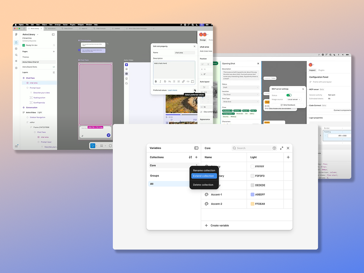
1 month agoHow to Supercharge your Design System with Slots | Figma Blog
Slots enable design systems to balance consistency with flexibility by allowing designers to customize components dynamically without detaching instances, reducing variants and maintenance while preserving system integrity.
fromTylercoderre
2 months agoDesign Systems Checklist - Tyler Coderre
This is how your product "talks" to people. It's the look, feel, and flow that makes everything feel connected. When it all works together, users don't have to think too hard. Brand. Your brand is more than a logo or a cool name. It's what you stand for and how people remember you. It should guide every decision you make.
Web design
fromEntrepreneur
2 months ago3 Core Design Elements Your Website Needs to Thrive
Design systems require three interconnected foundations—composition, components, and concepts—to maintain clarity and usability as organizations scale, with accessibility embedded throughout to improve compliance and prevent costly retroactive fixes.
Design
fromSmashing Magazine
2 months agoSay Cheese! Meet SmashingConf Amsterdam - Smashing Magazine
SmashingConf Amsterdam (April 13-16, 2026) brings together designers and UI engineers for a single-track conference featuring live design work, practical workflows, and community-focused learning in an intimate venue.

fromblog.logrocket.com
2 months agoLinear vs. non-linear design: Which is better and when? - LogRocket Blog
Minimal doesn't always mean usable. This comparison shows how Linear-style UI keeps contrast, affordances, and structure intact, unlike brutalism's extremes or neumorphism's low-clarity depth effects. Daniel Schwarz Feb 5, 2026 2 min read Linear-style UIs look simple, but the theming system has to do real work. Here's how to meet WCAG 2.2 contrast requirements across light, dark, and high-contrast modes whether you're using a UI library
UX design


fromMedium
3 months agoHow top companies are using AI in their design workflows
Using a pre-built template strategy: The Atlassian team realized that AI was often messing up core elements and not completely understanding complex commands. So they created a sort of "design system" for their AI led prototyping. Here they feed a page with pre-coded elements which AI doesn't change, but lets the tool work on other elements which are open to interpretation in a way.
UX design

fromInfoWorld
3 months agoTailwind, AI, and building the future of software
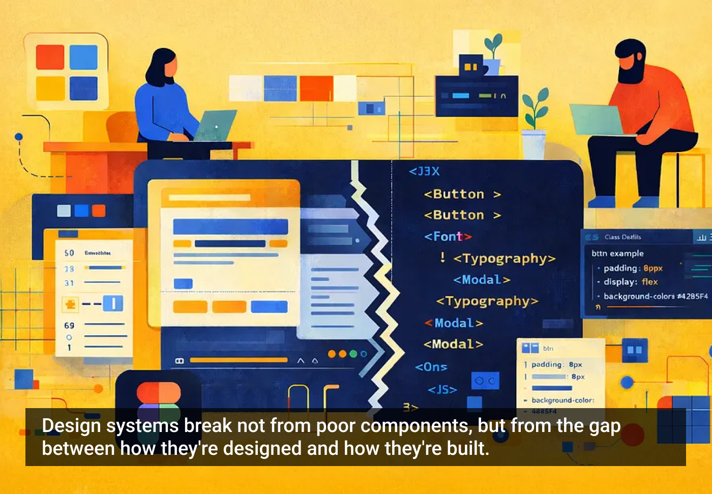
But the nature of web design has changed since CSS was first built. Most frameworks, whether it be Angular, React, or Astro, have become component-based. But even those components were designed to separate CSS and HTML. For instance, in Angular, a component consists of three files: a TypeScript file, an HTML file, and a CSS file. But those components are becoming more and more granular.
Web frameworks
fromdaverupert.com
3 months agoUsing your design system colors with contrast-color()
One predictable pain point with contrast-color() is that it only returns black and white named colors. From a design systems perspective, that's not ideal because you want your colors. You want your harmonious brand and the colors you and your team spent thousands of man hours in meetings deciding on. Those colors. In fact, an earlier version of Safari had color-contrast() (confusing I know, naming is hard) which allowed you to pass in a list of best candidates to choose from. I beleive that proposal got mired in standards discussions, color contrast algorithms, and competing proposals; and contrast-color() is what survived which got simplified down to a binary result.
fromMedium
4 months agoNew navigation paradigms, ChatGPT talks too much, AI coding tools
To navigate is to read the world in order to move through it, whether it means scanning a crowd to find a familiar face, deciphering the logic of a bookstore's layout, or following the stars at sea. This ability has always been mediated by tools (many of them disruptive and transformative). Still, the rise of artificial intelligence presents us with a radical promise: a world where we no longer need maps, because the information or the product 'comes to us.'
UX design

UX design
fromMedium
5 months agoStyle Guide vs Design System: The One Mistake Killing Your Team's Speed & Consistency
Style guides provide static visual rules (colors, typography, icons, spacing) to ensure brand consistency, suitable for small teams but insufficient for large-scale reusability and interaction guidance.
fromMuse by Clios | Discover the latest creative marketing and advertising news. Muse by Clio is the premier news site covering creativity in advertising and beyond.
5 months agoWhy Creative Agencies Lost-and What They Must Do to Start Winning Again | Muse by Clios
Media shops organized around a simple machine: More client cash flowing through their pipes means more revenue. Fees. Volume incentives. Data leverage. Margin on margin. Their economics compound. A dollar placed becomes infrastructure for the next dollar. Creative agencies built the opposite. Every idea is a bespoke project. Every campaign starts from scratch. Deliver, invoice, repeat. There's no compounding. No flywheel. Just craft sold by the hour.
Marketing tech
fromMedium
6 months agoThe hidden structure of digital products
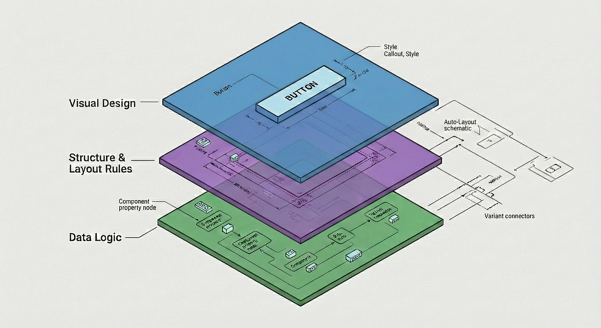
To truly understand a digital product as a complete entity, our industry has two powerful but somewhat disconnected frameworks. Brad Frost's Atomic Design gives us the language for the visible architecture of a product, the tangible components we see and interact with. Parallel to this, the academic work of MIT's Daniel Jackson on Conceptual Models gives us a rigorous language for the invisible foundation, the deep logic and rules that govern how a product behaves.
UX design


fromMedium
6 months agoWriting for AI, X-shaped designers, the lies we tell ourselves
Maybe you've gotten comfortable writing prompts or using simple one-click tools. But as AI interfaces start to take different forms, many of them are still kinda hard to figure out. Navigating them can be overwhelming. It doesn't feel like you're using these products so much as deciphering them. The engineering is powerful, but the flows don't make sense. If you're lost in an AI user flow, blame the writing.
UX design
fromMedium
6 months agoCommon UX mistakes everyone still makes 2.0
Build consistently. It's the number one UX improvement every developer can make. A design system only works when everyone builds the same page in the same way. When that happens, the benefits are obvious: Developers can work on each other's pages without becoming bottlenecks. The CSS team deals with fewer one-off HTML scenarios. Predictable HTML makes theme swapping and real-time white labelling possible. Yes, it might feel slower at first, but consistency will save you far more headaches later.
UX design

fromTechCrunch
6 months agoKnapsack picks up $10M to help bridge the gap between design and engineering teams | TechCrunch
That's where Knapsack comes in. It's a collaboration platform specifically designed for enterprises that need to resolve misunderstandings between UI designers, product managers, and engineers. Knapsack creates a unified workspace that connects with tools like Figma and Git, ensuring that any design changes are automatically updated in the code and documentation. This approach makes sure that everything remains up to date, so branding stays consistent across all digital products.
Startup companies
fromCreative Bloq
7 months agoWhy Spotify hired a dedicated typographer
Staff typographer, Spotify Bianca is a designer specialising in typography, type design, and type technology. Currently, she is a staff typographer working on Encore, Spotify's design system, where she drives innovation in typography in cross-platform product experiences. Before joining Spotify, Bianca led creative direction on brand typefaces and complex type systems for global companies like Amazon, BBC, FedEx, Indeed, and Google while at Dalton Maag.
Typography
fromArchDaily
8 months agoSwitching Perspective: How 63 Colors Interact with Architectural Spaces
In architecture, the effect of color is rarely neutral. It has the power to calm or energize, to expand or compress space, to unify or divide. Far from solely being a decorative layer, color is a tool that architects, interior designers, and designers use to structure atmosphere and perception. Alongside light, material, and proportion, it is one of the most precise instruments available for guiding spatial experience.
Design
UX design
fromBencallahan
8 months agoWhere AI is failing design systems, and where we are failing AI - bencallahan.com
Design systems require deterministic, high-quality, durable outputs, so tooling must minimize AI-driven probabilistic instability, inconsistency, and security concerns in production workflows.
[ Load more ]