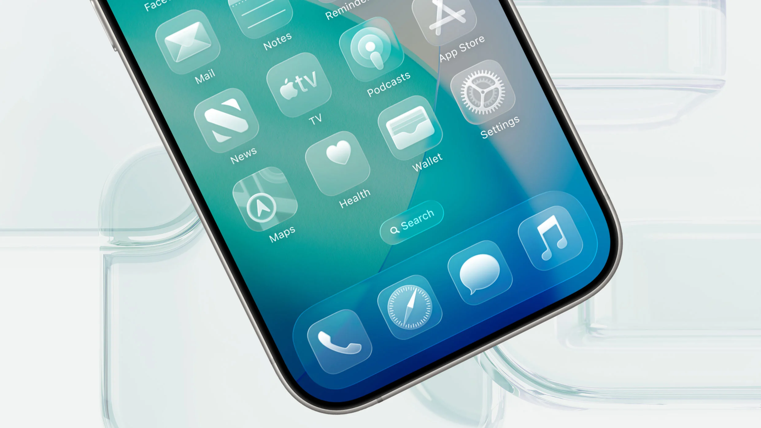
#ui-design
#ui-design
[ follow ]
#accessibility #user-experience #ai-design-tools #liquid-glass #prototyping #usability #ios-26 #web-development
fromGSMArena.com
2 weeks agoSpotify has redesigned its tablet app, here's what's new
The redesigned tablet UI isn't just a scaled up phone version as before. Instead, it's designed to take advantage of the extra screen real estate, so you can browse and discover new favorites right alongside what you're already playing.
Mobile UX


fromJim-nielsen
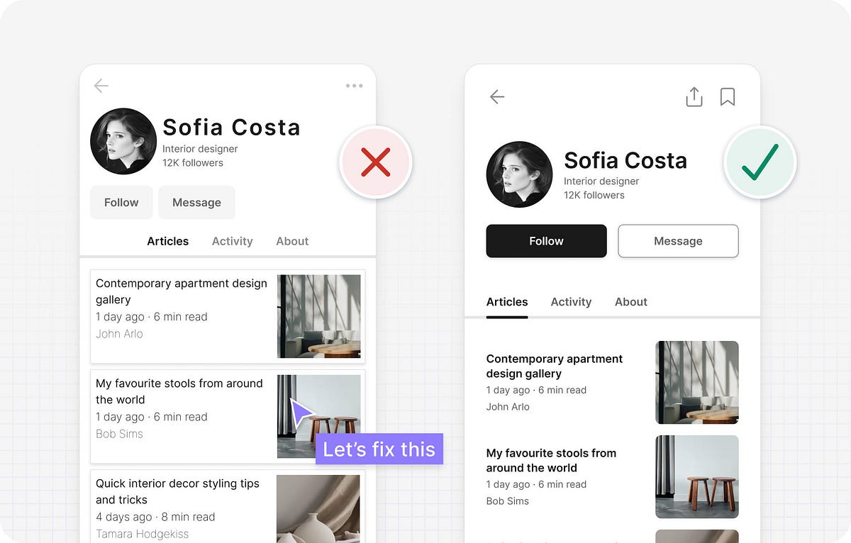
3 months agoCTA Hierarchy in the Wild
The other day I was browsing YouTube - as one does - and I clicked a link in the video description to a book. I was then subjected to a man-in-the-middle attack, where YouTube put themselves in the middle of me and the link I had clicked: Hyperlinks are subversive. Big Tech must protect themselves and their interests.
UX design


fromMedium
3 months agoUI Design with Nano Banana Pro
Nano Banana Pro (Gemini 3 image model) is particularly strong for UI design because of its 99% text accuracy, its ability to understand spatial layout, and its support for high-resolution 4K output. In this article, I want to share my 5 favorite cases of using this model for UI design tasks. ( Quick note: I won't dive into a critique of the output generated by AI in this article, letting you decide whether you like it or not)
UX design
fromSearch Engine Roundtable
3 months agoMicrosoft Bing Testing Retro Local Pack In Search Results
But now, Bing might be testing a more retro, older-looking interface for the local pack in the Bing search results. This was spotted by Frank Sandtmann who posted this screenshot on LinkedIn: Frank wrote, "Bing appears to be testing a new (?!) design for its Places results. With the small map, it looks a bit retro." I cannot replicate this, I've been trying with several browsers over the past few days but I was unsuccessful.
UX design
fromFrontendmasters
4 months agoThe Deep Card Conundrum
Imagine a card that isn't just a 2D plane, but a container with actual volume. A card that holds a miniature 3D world inside it. When you rotate this card, you don't just see it skew, you see the elements inside it shift in perspective, revealing their depth. It's like holding a glass box filled with floating objects. The effect is mesmerizing.
Web design
fromMedium
5 months agoLearning by doing: an essential method in a design course
Since 2017, the UI Design Master at Innovation School has been the first Italian course focused on the design of visual user interfaces. Starting from the 3rd edition, I joined scientific coordinator as part of the faculty, following students through their project work.
UX design
fromMedium
5 months agoThe shortest path from thought to action
When psychologist Paul Fitts published his 1954 paper on human motor control, he likely had no idea that his insights would one day guide the design of everything from smartphones to virtual worlds. Fitts conducted his experiments using simple physical apparatuses, such as levers, styluses, and lighted targets, to measure how quickly participants could move and point to targets of varying sizes and distances. These experiments were precursors to the pointing and selection tasks that would later define human-computer interaction.
Mobile UX


fromInclusivecolors
5 months agoInclusiveColors - Accessible color palette creator
Instead of only working with a handful of colors, you can create a whole palette of swatches at the same time so you can see if they look good together. Precise control of every shades/tints in each swatch rather than being limited by autogenerated colors. See which color pairs contrast as you edit so you can create a palette with built-in WCAG accessibility.
Web design
.jpg)
fromMedium
6 months agoClaude For Code: How to use Claude to Streamline Product Design Process
Design-to-code translation (quick prototypes) Once you craft a high-fidelity mockup, you need to turn it into code. Previously, you have either to wait for developers to do it or learn how to code and do it yourself. Nowadays you can simply send your design to Claude and it will code it. I typically use Claude to generate an HTML + TailwindCSS prototype from UI specifications or UI screenshots. Here is how it works. You attach a screenshot of the UI you want to craft and let Claude do the heavy lifting for you.
UX design


fromInterconnected, a blog by Matt Webb
7 months agoThe destination for AI interfaces is Do What I Mean
Meanwhile AI chat suffers from the same problem from command lines to Alexa - how can i remember what to ask? Only this time the problem is exacerbated by the fact that AI is capable of practically anything making the task less one of remembering commands but a creative one of coming up with great questions or delivering an interface to discover them and then wrapping the resulting prompts as buttons.
Artificial intelligence
fromMail Online
7 months agoiPhone users BAFFLED to discover 'disturbing' design hidden in alarm
iPhone users have been baffled to discover a secret design element that has been hidden in plain sight for years. In a viral post on X (formerly Twitter), one user has shared their strange discovery about the iPhone alarm. When you set an alarm on an iPhone, it looks as if you are spinning a wheel with the numbers one through 12 written around the circumference. However, users have now discovered that this isn't really the case.
Apple

[ Load more ]