#dot-matrix
#dot-matrix
[ follow ]
#design #typography #ai #graphic-design #creativity #illustration #technology #svg #identity #nostalgia #typeface-design
fromItsnicethat
2 days agoYee Hawr: horsegiirL is the new face of Dinamo's half sans half serif experiment in type design
HorsegiirL was on billboards and posters across Berlin, London and New York, featuring cinematic studio shots with a hot desert sun casting five different, alphabetical shadows. This campaign was a serious move to share in the real world, as horsegiirL exists in physical space, in front of crowds.
Typography
fromThe Art Newspaper - International art news and events
3 weeks agoPressing issues: the vital role of printmaking in the history of art
Yale came to me and said there isn't an overarching book about the history of printmaking; they wanted it to be about the printed image. There are a lot of books about printing-about the history of journalism or the history of books, the printing press and the printed word-but not so much about the printed image and its processes. So that was my challenge.
Arts

Design
fromdesignboom | architecture & design magazine
1 month agoa rich palette of saturated hues meet industrial precision in mara's renewed digital identity
Mara enters 2026 as a global interior design protagonist, expanding from office and hospitality into residential markets while strengthening its digital identity and sustainability commitment.
#typeface-design
Typography
fromI Love Typography Ltd
1 month agoSteven Heller's Font of the Month: Curve Display - I Love Typography Ltd
Curve Display is a Didone-inspired display font that balances classical elegance with experimental, abstract letterforms, making it distinctive yet accessible for contemporary graphic design.
fromAlexharri
3 months agoASCII characters are not pixels: a deep dive into ASCII rendering
One thing I spent a lot of effort on is getting edges looking sharp. Take a look at this rotating cube example: Try opening the "split" view. Notice how well the characters follow the contour of the square. This renderer works well for animated scenes, like the ones above, but we can also use it to render static images: The image of Saturn was generated with ChatGPT.
Software development
fromBored Panda
2 months ago80 Vintage Ads That Show Which Values Changed And Which Stayed The Same Over Time
We might be exposed to more ads and commercials today than ever before in human history, but the idea of advertising itself is certainly not a new concept. According to Instapage, the first signs of advertisements actually appeared in ancient Egyptian steel carvings from 2000 BC. Meanwhile, the first printed ad was published in 1472, when William Caxton decided to advertise a book by posting flyers on church doors in England.
Marketing
Miscellaneous
fromdesignboom | architecture & design magazine
2 months agoworking LEGO printing presses can transfer images and logos onto paper
Two fully functional LEGO printing press models demonstrate historic printing methods by transferring images onto paper using a lever-operated platen press and a roller-based press.
fromwww.theguardian.com
1 month agoWith its fluorescent characters and ASCII text, Marathon is a masterclass in 90s nostalgia
It's now an online sci-fi extraction shooter in which players beam down to the planet Tau Ceti IV to scavenge for loot, carry out missions and potentially blast each other in the process. Its closest rival is Arc Raiders, which makes a similar use of stylised retro-futurism.
Video games
fromYanko Design - Modern Industrial Design News
2 months agoA Typewriter-Inspired Calculator in Vibrant Coral Red Just Stole Our Heart - Yanko Design
At first glance, the GIA looks like it time-traveled from a 1960s Italian design studio, stopped briefly in 2026 to pick up some modern tech, and landed on your desk with a personality. The inspiration comes from Olivetti typewriters, those gorgeous mechanical machines that made office work feel like an art form. Remember when tools had character? When objects didn't just function but made you feel something? That's what Bedrina is tapping into here.
Design
Arts
fromdesignyoutrust.com
2 months agoBeautiful Daily Retrowave City Pop Landscapes From Club Retro, A Neon-drenched Instagram Gallery Of Vaporwave Dream Worlds
Collection of diverse visual-art features and lifestyle pieces, including paintings, architecture drawings, illustrations, murals, vintage posters, surreal digital art, and practical guides.
fromTheSavvyGamer
1 month ago10 Reasons to Keep a Printer at Home & 10 Why You Shouldn't - TheSavvyGamer
There's a real convenience to being able to print a lease agreement, a medical form, or a tax document without having to run to a copy shop or library. When you need something signed and returned quickly, having a printer at home means you don't have to rearrange your schedule around a trip across town. That kind of on-demand access saves both time and stress, especially during situations that are already a little chaotic.
Miscellaneous
fromYanko Design - Modern Industrial Design News
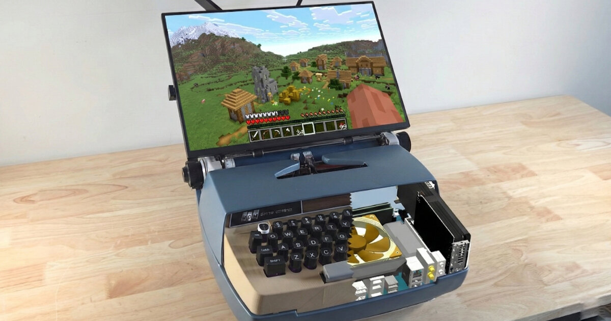
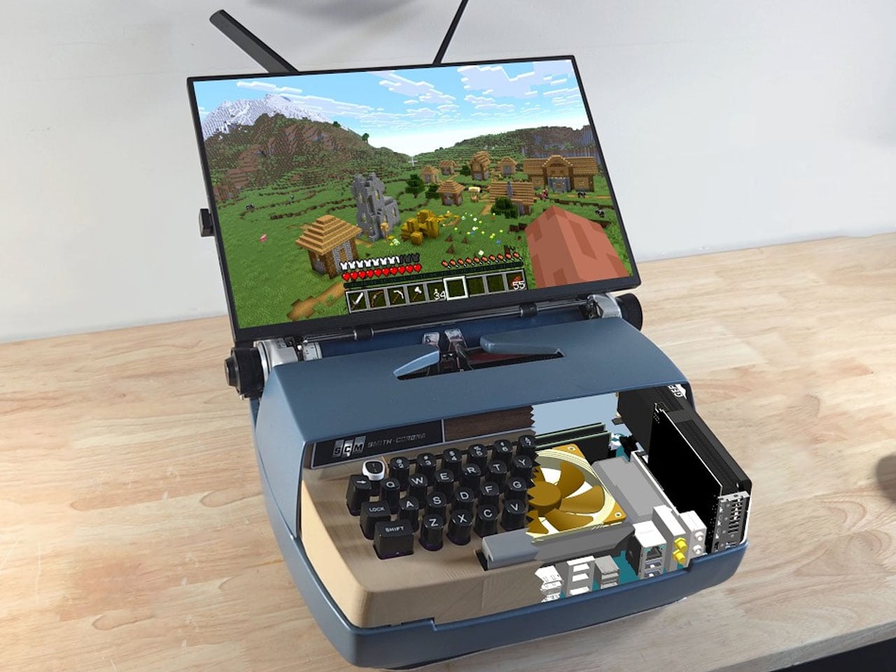
2 months agoZerowriter Ink Is an Open-Source E-Paper Typewriter Built for Writers - Yanko Design
Trying to write on a laptop means fighting a machine that is also a notification box, streaming portal, and social feed. Distraction-free apps help, but they still live inside the same browser-and-tab chaos, surrounded by everything else your computer knows how to do. Some writers just want a device that only knows how to produce plain text and does not care about anything else happening in the world.
Gadgets
Design
fromYanko Design - Modern Industrial Design News
1 month ago5 Floating Designs That Look Like Photoshop (But They're Real) - Yanko Design
Floating design lifts architectural elements from the ground to create visual lightness, spatial clarity, and refined interventions that balance engineering precision with aesthetic intent.
Photography
fromdesignyoutrust.com
2 months agoArtist Creates Nostalgic Pixel Tributes That Capture Gaming's Golden Age
A wide-ranging showcase of visual creativity, highlighting photography, illustration, sculpture, design, and inventive art projects from global contemporary artists and cultural oddities.
Typography
fromItsnicethat
1 month agoEleanor Yang merges the synthetic and organic to make typography you can touch
Synthetic Nature presents three typefaces—DNA, Mesh, and Data—that metaphorically represent life through biological, network, and computational structures, exploring how biology, computation, and culture merge.
fromWIRED
1 month agoThis Digital Picture Frame Wants to Bring People Closer to a Holographic Future
Upload any picture or video, and Musubi uses artificial intelligence to extract the most important part and hover it in space as a 3D image within the frame. That could be a video of a child's first steps or a snapshot of a birthday party. The image will be displayed in 3D form, viewable in all its holographic glory across nearly 170 degrees.
Gadgets
Design
fromItsnicethat
2 months agoVisual communication that challenges convention: Phantasia on how graphic design can forge true collaboration
Phantasia, a Barcelona-based design studio founded in 2021, prioritizes meaningful projects that serve communities through intentional collaboration, diversity, and accessible communication.
fromSmashing Magazine
1 month agoFresh Energy In March (2026 Wallpapers Edition) - Smashing Magazine
Designed by artists and designers from across the globe, each wallpaper comes in a variety of screen resolutions and can be downloaded for free. A huge thank-you to everyone who shared their designs with us - this post wouldn't be possible without your kind support!
Design
fromI Love Typography Ltd
2 months agoHow Not to Take 10 Years to Design a Typeface - I Love Typography Ltd
I would listen with awe and think, 'That must have been a real challenge. It must be exquisitely crafted and probably a little bit groundbreaking too.' So it feels slightly absurd to admit that my last typeface, Nave, also took around ten years to complete. Not because I spent a decade polishing outlines or expanding the character set, but because I took so many wrong turns trying to chase a vision I hadn't properly defined.
fromI Love Typography Ltd
2 months agoSteven Heller's Font of the Month: Cattivo - I Love Typography Ltd
Infused with history, the slab cannot help but suggest the old West's frontier clichés, for such ephemera as classic wanted posters, political broadsides, cautionary warning signs, and more generic commercial applications. Cattivo is a brand-new 18-font family that, when used in any weight and size, cuts through nostalgic predictability and provides a welcome alternative to such popular Egyptian-style slab serifs as Stymie and Memphis.
Typography
fromFast Company
1 month agoMattel has a new custom font, and it's full of playful hidden details
Mattel operates dozens of brands under its corporate umbrella, each with their own visual identity and brand voice. But, until now, Mattel has never had its own proprietary typeface for its overarching brand, instead opting to license multiple existing fonts on a global scale—an endeavor that was not only expensive, but also came at the cost of visual consistency across Mattel's many product lines.
Typography
[ Load more ]